Make Your Own Aurebesh Font
Draw the Aurebesh alphabet by hand and turn it into a real font you can type with. Free template sheets, step-by-step drawing tips and the build process.
Every Aurebesh font out there is a clean, machine-made one. We wanted one that looks like someone scrawled it on a cargo crate in Mos Eisley, so we drew our own. You can see how it turned out in the AurebeshFiles Hand font.
This page shows you how to make yours. Most of the work is drawing. You fill in a set of template sheets, one letter per box, and a small script traces your ink and turns it into a font file you can install and type with.
Jump to:
- What you need
- Download the templates
- How to read the guides
- Draw your letters
- Create the font
- Tips and common mistakes
What you need
- A drawing app that can draw over a PNG and export a full-size PNG. Procreate on iPad is what we used, but Photoshop, Illustrator, Krita, Clip Studio, Sketchbook, Affinity and GIMP all work too. You don’t need an iPad. You can also print the sheets, draw on paper and scan them back in.
- The five template sheets below.
You don’t have to draw everything. Empty boxes get skipped, and any lowercase letter you leave blank uses your uppercase one instead. Sheet 1 on its own is enough for a working font.
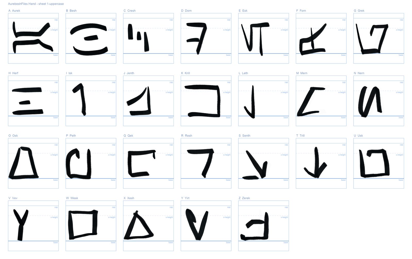
Here’s our finished uppercase sheet, laid over the template so you can see how the letters sit in their boxes:
Download the templates
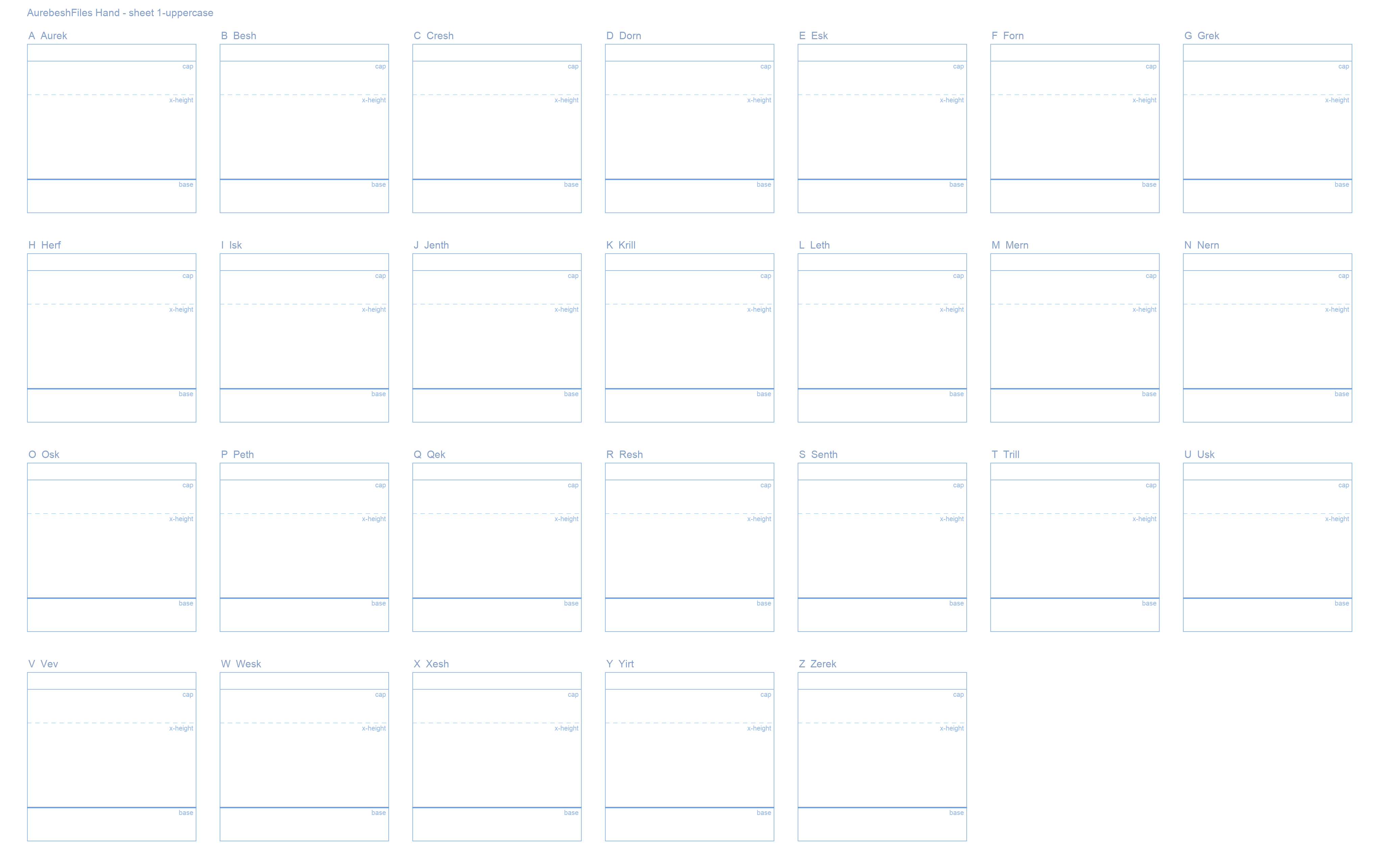
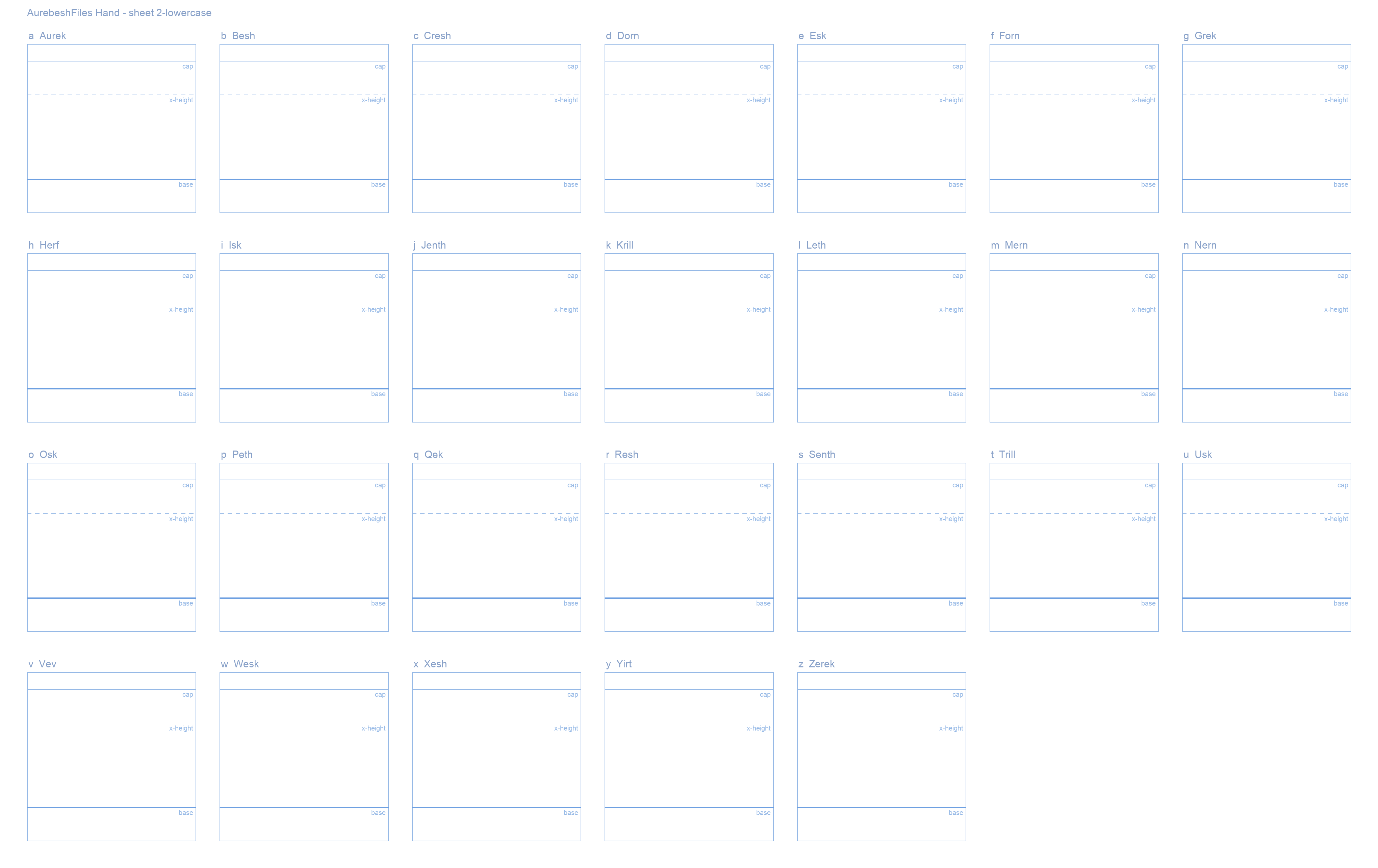
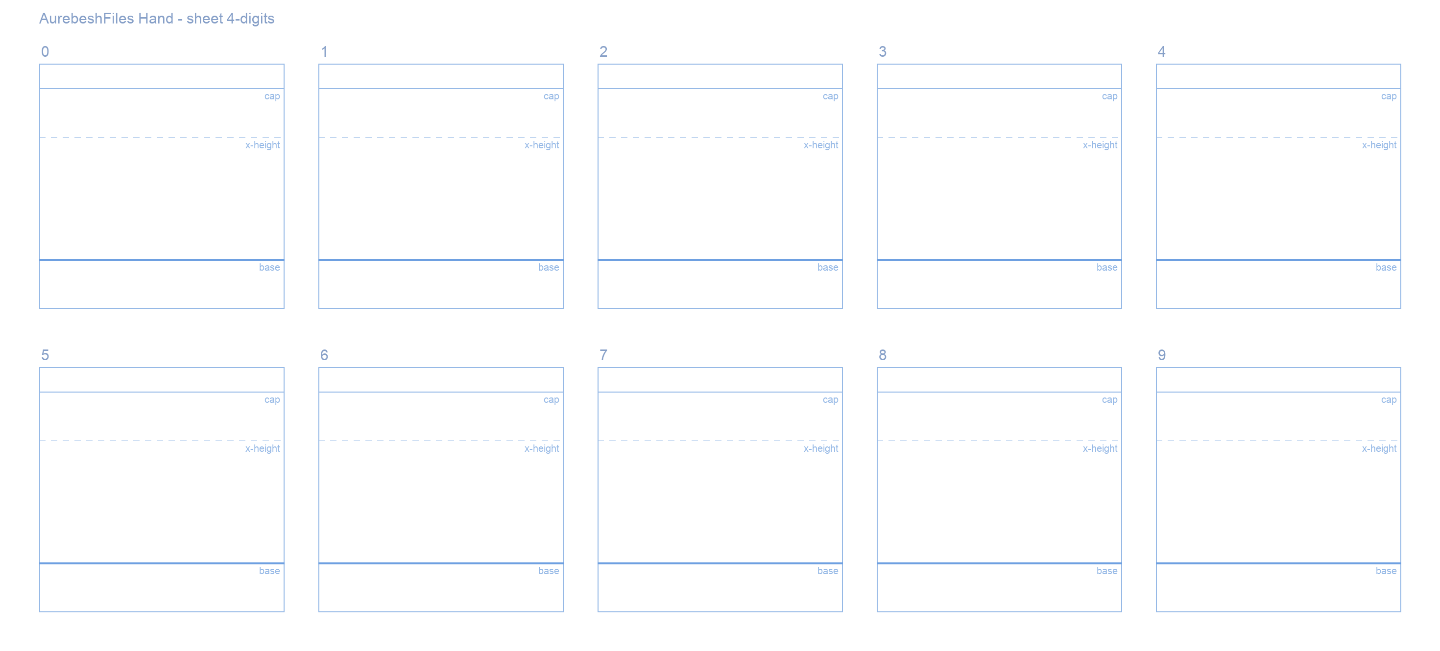
There are five sheets. Each one is a PNG at an exact pixel size, and that size matters:
- The build reads each box by its position, so your finished drawing has to stay within the same width and height as the template.
- Your letters can be smaller than the box, as in our example above. The extra white space gets trimmed.
Download the full-size files from the links. Don’t screenshot the previews.
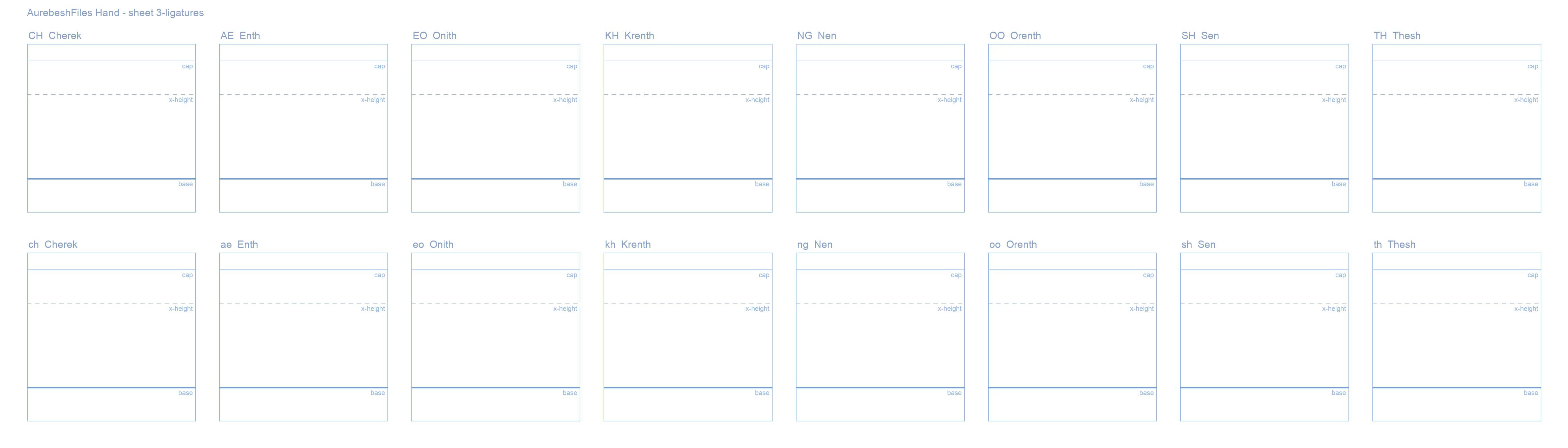
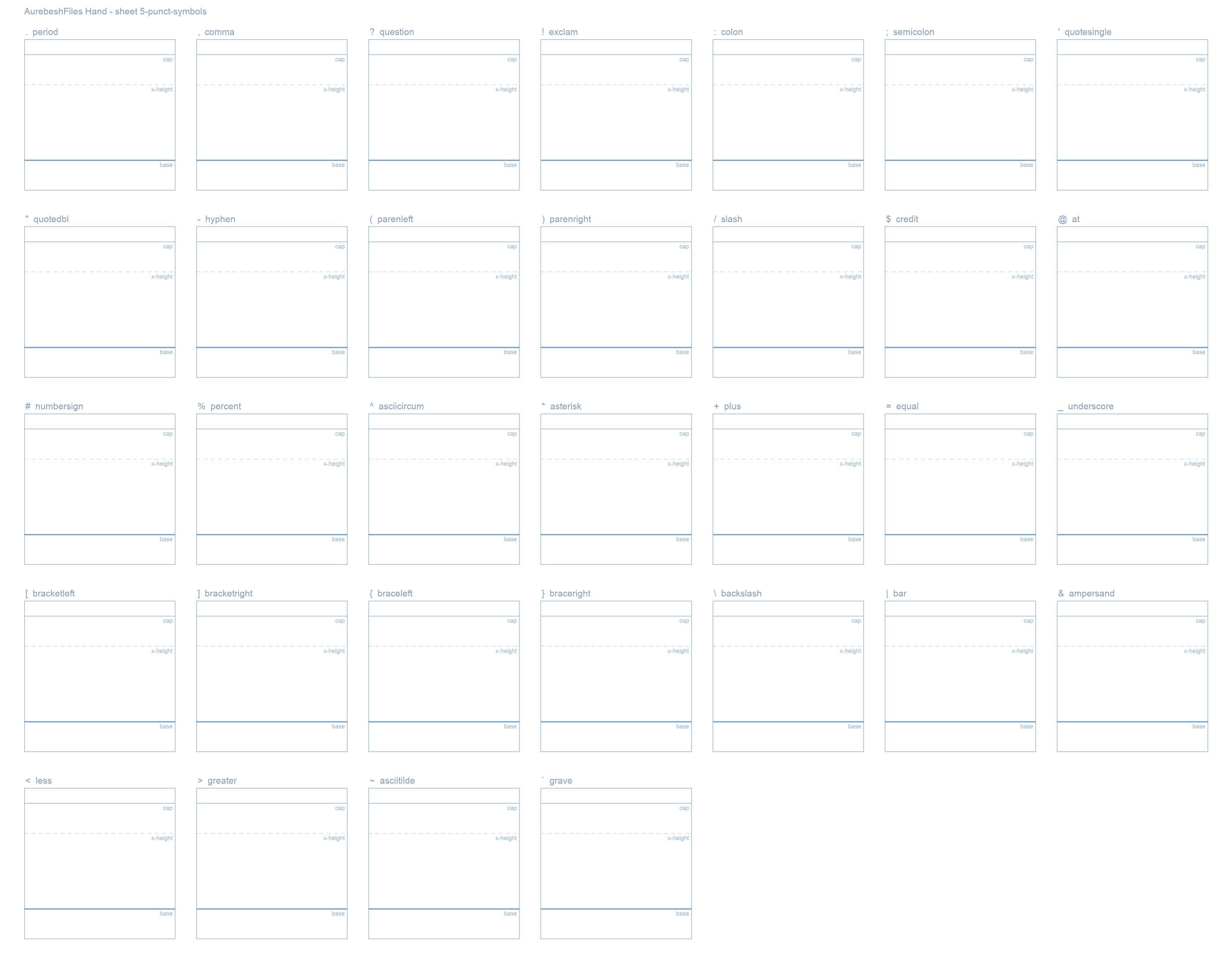
. , ? ! : ; ' " - ( ) / $ @ # % ^ * + = _ [ ] { } \ | & < > ~ ` 4080 × 3190 px. Download 5-punct-symbols.pngAbout the ligatures. Aurebesh has single letters for some letter pairs. Once they’re in your font, typing TH (or Th) swaps in your uppercase Thesh automatically, and th swaps in the lowercase one. Same for the other seven. Browsers and most apps turn this on by default.
How to read the guides
Every box has the letter’s name at the top and three light-blue guide lines:
- base (the thick line near the bottom): every letter sits on this. It’s what keeps your text in a straight line instead of bouncing.
- cap (the top line): uppercase letters reach up to here.
- x-height (the dashed line in between): where a lowercase letter would normally top out. On the lowercase sheet you can follow it or ignore it. It’s your alphabet.
- Below base is room for descenders, if a glyph has a tail that hangs down.
Up and down matters. Left and right doesn’t. The box maps straight onto the font’s height, so where your letter sits against the base and cap lines is exactly where it lands in the font. Nothing gets scaled or nudged to fit. Left-to-right is the opposite: draw anywhere across the box, and the build lines up each letter’s left edge and gives it a slot as wide as its ink, so narrow letters get narrow slots on their own.
Stay inside the box. A slight overshoot isn’t fatal, since ink just past the edge is still picked up, but anything much further out gets cut off, and ink from the next box over can bleed in.
Draw your letters
In your app of choice:
- Import the image.
- Create a new layer to draw your letters on.
- Draw your letters in black. Be as creative as you like!
- When you’re done, hide the template layer so all you see are your letters.
- Export as PNG, just the letters on a transparent or white background.
- Name each file by its sheet number:
1.png,2.pngand so on (1-uppercase.pngworks too).
On paper
Paper works too, but the results may come out a little rougher.
- Print the template sheet.
- Draw your letters with a black marker.
- Scan the sheet. A phone photo usually comes out skewed or unevenly lit, so use a scanner if you can.
- Name each file by its sheet number:
1.png,2.pngand so on (1-uppercase.pngworks too).
Create the font
You have two options for turning your sheets into a font.
Send us your files
Send us your files and we’ll check them, clean them up and convert them for you. Email them to us, and give us a few days to create your new font! Tell us what to call your font and how you’d like to be credited.
Your font, your rights. You keep ownership of your drawings and your font. By sending them to us, you confirm you drew them yourself, and you give AurebeshFiles permission to use, edit, publish and share them, forever and free of charge, including in our sites, apps and promotions. That permission doesn’t take anything away from you: you can still use, share or sell your own font however you like.
Free for everyone. We publish every font we build under the SIL Open Font License, with you named as its creator. Anyone can download it and use it in anything, personal or commercial. They just can’t sell the font file on its own or pass it off as their own.
Build the font yourself
If you’re comfortable with Python, you can convert your files yourself. Check out the code on GitHub.
Tips and common mistakes
It helps to know how the tracer sees your drawing: a pixel only counts as ink if it’s darker than middle grey. Everything lighter is treated as blank paper. Most mistakes come from that.
- Wrong canvas size. This is the big one. If your canvas isn’t exactly the template’s width and height, letters land in the wrong boxes. Never resize or edit the template sheets themselves.
- Ink that isn’t dark enough. Pale grey, light pencil and semi-transparent brushes can vanish completely. Use pure black at full opacity.
- Exporting a flattened JPG. Export PNG.
- Letters floating off the base line. Vertical position isn’t corrected, so your text will bounce up and down. Sit everything on base.
- Going well past the box edges. A little overshoot is fine, but go much further and the overflow gets cut off, or picked up by the neighboring letter.
- Uneven stroke weight. Pick one brush and keep it for every sheet. Go bold enough to read at small sizes, and keep it the same everywhere.
- Tiny dots. Very small specks get thrown away as noise, so draw periods, colons and dots chunky.
- Hairline strokes. The tracer smooths outlines, which can make very thin lines break up. Thicker is safer.